Analytics
Measure your performance with Stream Analytics data
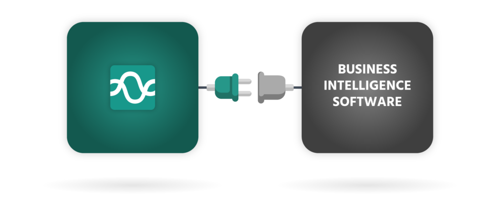
Analytics provides you with access to your Stream data and connects to business intelligence tools to analyse performance.

Report using your BI tool of choice
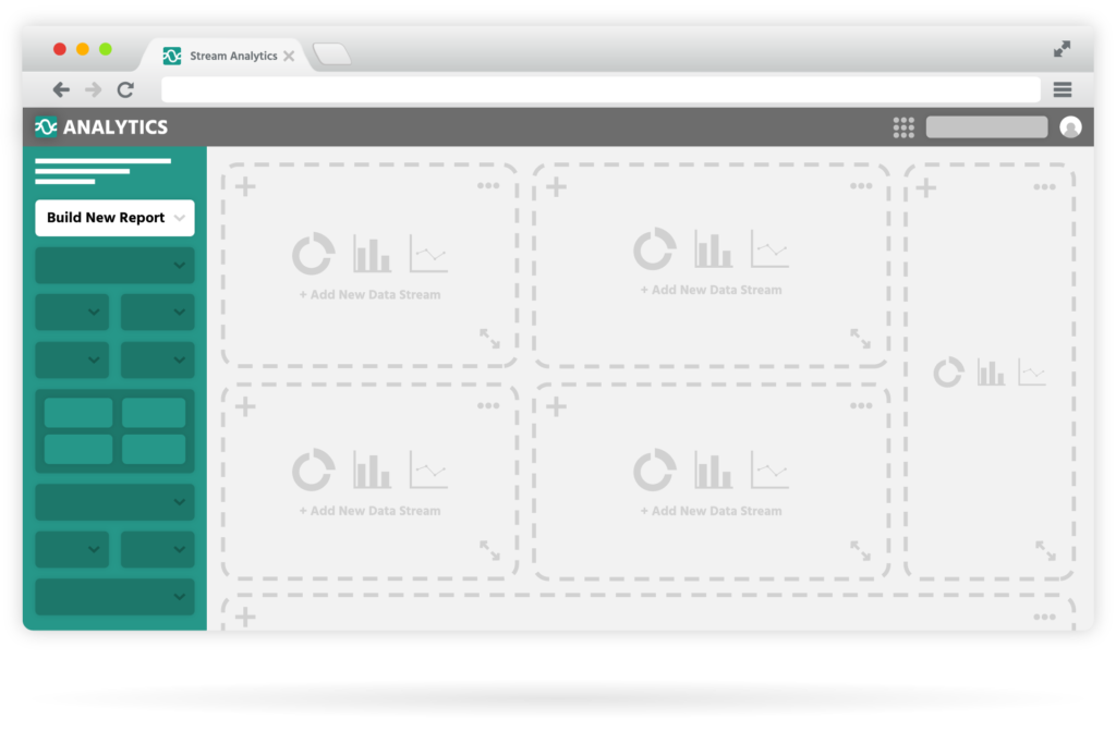
Create custom dashboards & reports
Measure your KPIs
Secure analytics data

Analytics features
Your complete analytics toolkit
All the tools you need to track and report key business metrics.
Build custom reports & dashboards
Access data via multiple BI tools
Analyse on the go
Easily share
Daily data updates
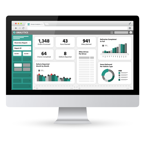
Smart dashboards
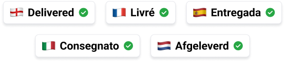
Multi-Lingual Transport Management System
Plan less, deliver more in your preferred language, across both the desktop application and ePOD app.
How it works
Analytics that drive logistics performance
Connect Stream with your business intelligence tool of choice in three easy steps.
Subscribe to Analytics
Connect to your BI tool
Build and analyse
Integrations
Integrate your existing systems
Use Stream as an approved ShipTrack carrier and pass tracking information to Amazon to keep your VTR scores above 95%.
Frequently Asked Questions
Stream Analytics data is updated daily, so you can visualise your data and spot trends and patterns that you might not have been aware of before. Real-time data on the status of your drivers, vehicles, and runs updates throughout the day and can be accessed in Stream.
You can set custom date ranges to view data from a set time period, whether that be yesterday, last week, the past 3 months or the whole year, and even compare to previous periods. Stream Analytics looks at data in your Stream account from the last 18 months, but you can use our Extended Data Retention to increase the amount of time this data is held for.
Yes! With the Stream Analytics add-on, you can access your data in Power BI to build your own reports, dashboards and visualisations.
Yes! With the Stream Analytics add-on, you can access your data in Tableau to build your own reports, dashboards, and visualisations.
Yes! With the Stream Analytics add-on, you can access your data in Qlik to build your own reports, dashboards, and visualisations.
With the Stream Analytics add-on, you can access your data in your BI (business intelligence) reporting tool of choice, be that Power BI, Tableau, Qlik, or another tool. If you don’t currently use a BI tool, we recommend accessing Stream Analytics data in Google Data Studio.
Plan less, deliver more.
Slash your route planning time, cut your delivery costs and exceed your customer’s expectations.