In the most recent update for Stream (version 4.7.33), we’ve implemented a number of mobile app user interface (UI) improvements to help make daily use of the app a much better experience for drivers.
Check out the details below.
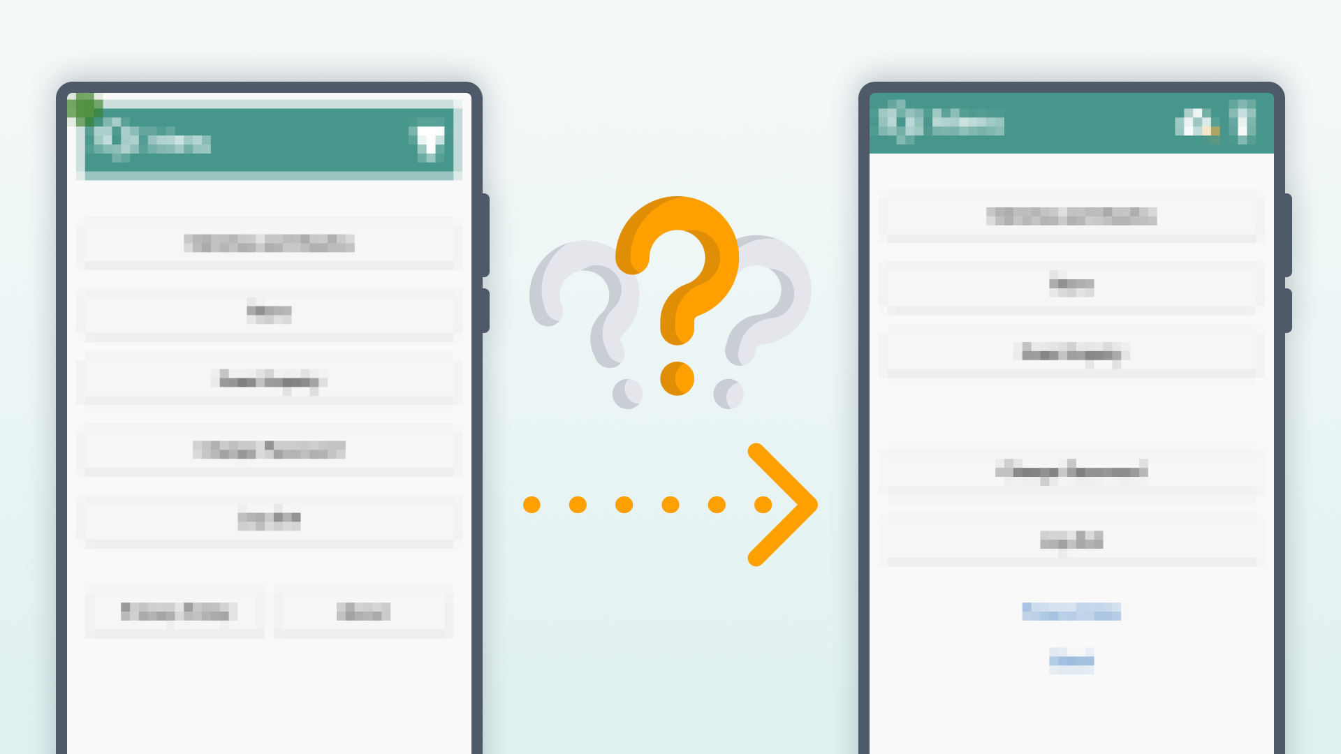
Improved header layout and new icons
Header now flush to the edge of the display
When opening your app for the first time after the update, this may be the first thing you notice.
The header now runs flush with the edge of your devices screen, modernising the appearance and creating more real estate for buttons and other options that may become available as the app continues to evolve.
New ‘unsent data’ and torch icons
The header icons now appear sharper and clearer than before, with our upgraded icon pack.
The ‘unsent data’ icon (previously a coloured dot badge) has been changed to a cloud upload icon, with a coloured dot representing the quantity of unsent data items needing to be synced back to Stream, and will now only appear if the device has unsent data.
The icon for switching the device’s torch on and off has been upgraded to a newer, cleaner, torch icon.
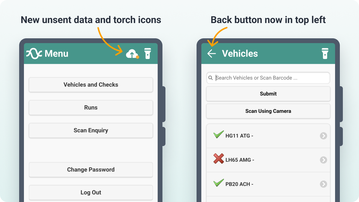
The ‘back’ button moves to the top left
The ‘back’ button now sits in the top left of any screen where this function is available, providing a more natural progression when moving backwards to a previous screen.
Numeric keypad for entering vehicle mileage
No more navigating to the numeric section of your device’s keyboard. The mobile app will now force the use of a numeric keypad when entering the current mileage for a vehicle at the start of a vehicle check.

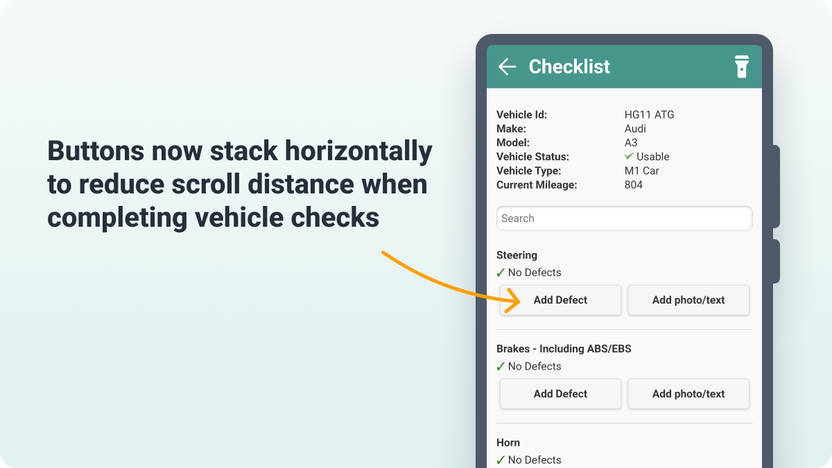
Less scrolling required when completing vehicle checks
The additional option buttons on ‘passed’ checks now display horizontally, reducing the amount of scrolling a driver has to perform in order to complete their daily checks.
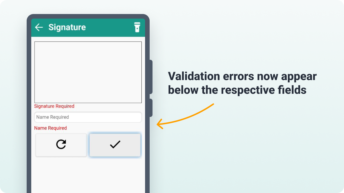
Validation errors now appear below their respective fields
It’s now much clearer to see where fields containing errors are in the mobile app, with the validation error messages being moved to sit below the respective field when they are shown.
A few additional mobile app UI fixes
- ‘Refresh’ buttons now appear next to the content it will refresh, as opposed to in the app header
- ‘Cancel’ option removed on screens where the back button is present to avoid incorrect button presses
- ‘Change Password’ and ‘Log Out’ buttons have been separated from the other items on the main menu
- ‘Privacy Policy’ and ‘About’ options have been converted from buttons to links on the main menu
- Reduced the size of the ‘Version number’ on the login screen
- Text shadows removed from page titles in the header
- Alignment of header icons fixed
- ‘Back’ button has been removed from the login screen
- Stream logo is now hidden whenever the ‘back’ button is present
- Only icons relevant to the home screen now load in the header when the app is booting up
We add new features and improvements into Stream every single month, to try and help users get more out of the platform.
Check out the releases page to stay up to date with everything that’s arriving each month.